
Welcome to the use.id visual guidelines. These guidelines offer a complete overview of our visual identity system and its implementation. Correct representation of our identity is crucial to our success. A consistent brand identity helps to deliver our messages to all our stakeholders.
Our logo is the key identifier of our brand and represents the personality and ambition of our company. As much as possible, the logo must be applied on a white background to maintain clarity, impact and freshness.
Base image: Positive version
Hover image: Negative version
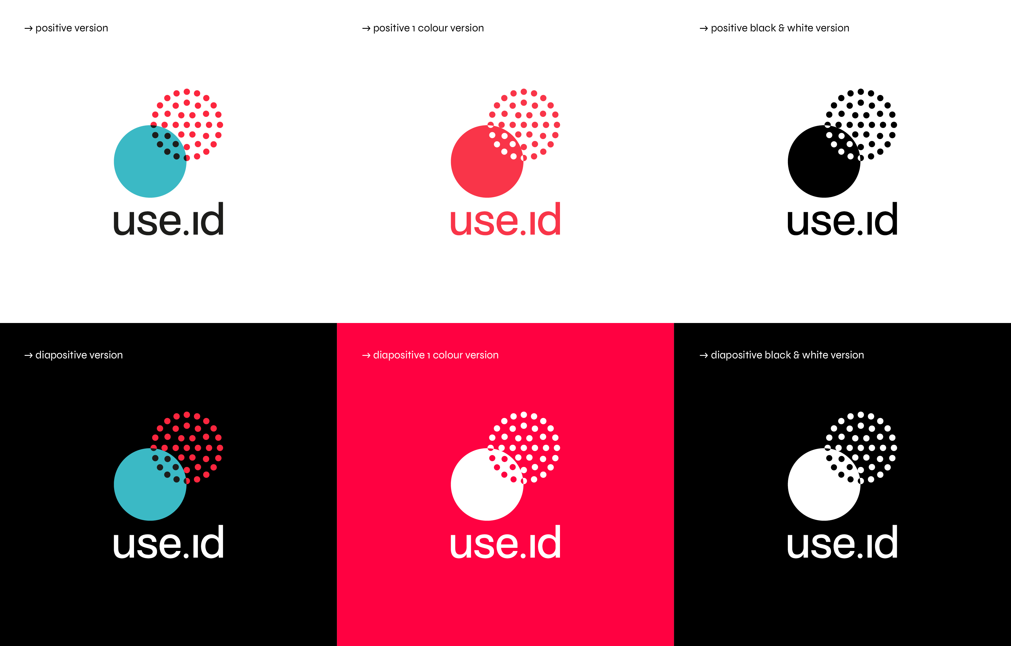
Logo versions
We have created the logo in different formats, for different print and reproduction techniques. Whenever possible, use the standard colour CMYK logo. When it is not possible to print or reproduce the standard CMYK logo, use the appropriate alternative logo from this set. Please note that the black & white version of the logo is only to be used exceptionally in purely black and white communication.
Exceptional version
In exceptional cases it is permitted to use this version of our logo. This version of the logo can be used if space limitations prevent you to use the regular version.

Logo Specifications
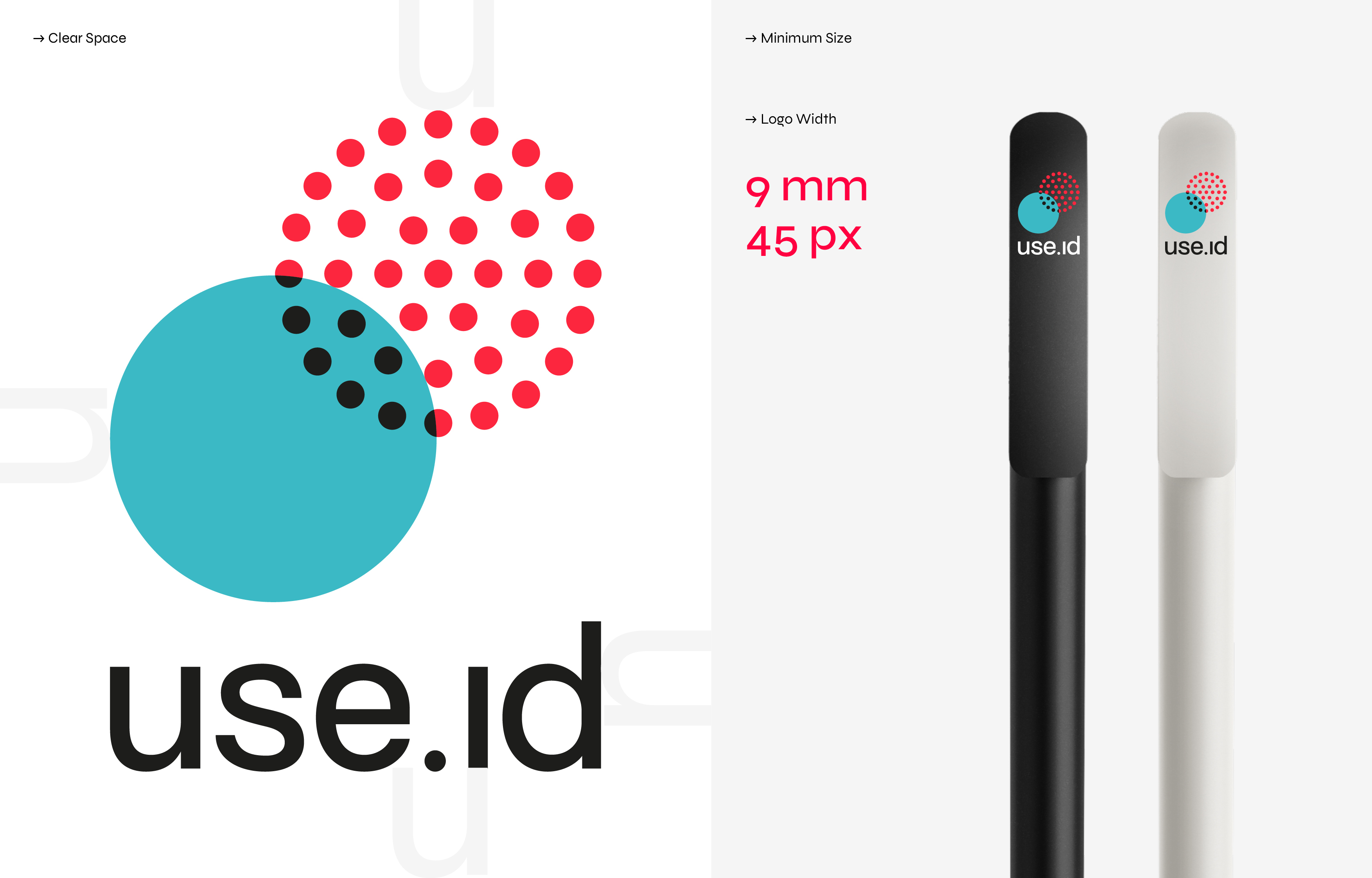
In order to maintain integrity, legibility and impact for the logo, we have defined a clear space around the logo – set to the heigth of the 'u' from our wordmark – to ensure we retain its integrity. No text or image must enter the clear space.
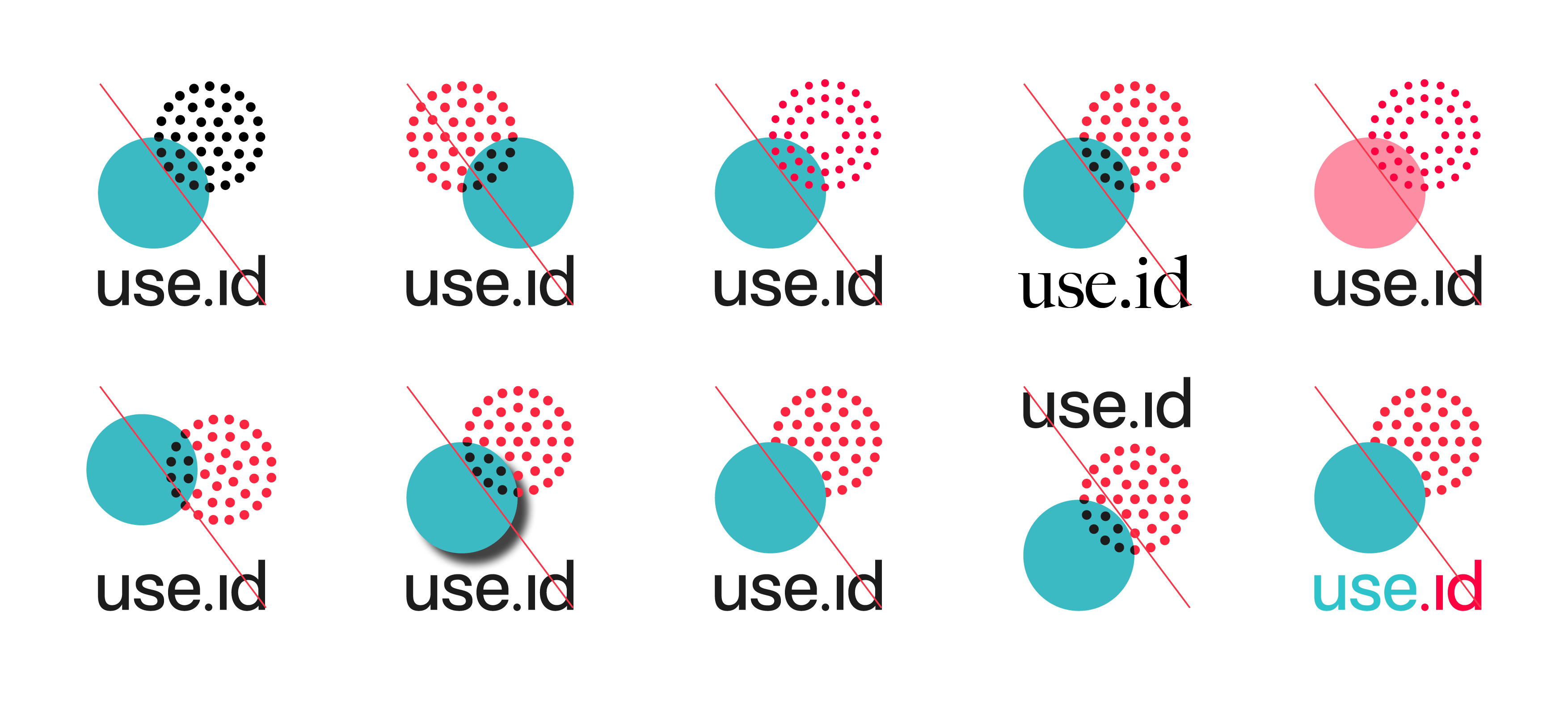
Logo dont's
Logo Symbol
In social media and apps it is allowed to use the symbol as a standalone element from our logo (separate from the wordmark).
In print and online we use one typeface family Syne (Google Font). Syne was specifically been chosen because it perfectly reflects our personality. The Syne family was originally designed in 2017 for the Art Center "Synesthésie". The Art Center aims to gather diverse artistic personalities in order to create new and enriching situations. Based on that idea, Syne is an exploration of atypical associations of weights and styles. Syne Regular is the starting point of the family. It is quite an archetypal geometric sans-serif, giving the art center a practical asset for their daily use. When getting bolder, the typeface also gets wider, forcing radical graphic design choices.
It's your data so you are in control.
Easily manage who can access what.
Syne regular
Almost before we knew it,
we had left the ground.
Syne semibold
Almost before we knew it,
we had left the ground.
Syne medium
Almost before we knew it,
we had left the ground.
Syne bold
The Syne typeface can be downloaded free from Google Fonts here
Almost before we knew it,
we had left the ground.
Our primary colours are useid_red, useid_green, black and white (the colours of our logo). Use of these colours guarantees top brand presence throughout all media.
useid_red
useid_green
Black
white
We can’t be restricted solely to using the primary colours, as we sometimes need flexibility with colour in our communications. The secondary colour palette has been created to complement the primary colours, to provide a palette of supporting colours that can be used for charts and other graphical applications.
red01
red02
red03
green01
green02
green03
blue01
blue02
blue03
grey01
grey02
grey03
Imagery style
Corporate imagery
In corporate communications, we always use illustrations based on circles (cf our logo). These circles lend themselves extremely well to highlighting a number of aspects of our product and, moreover, they symbolise data flows.

Applications
It is in our communication tools that all our brand identity elements come alive.
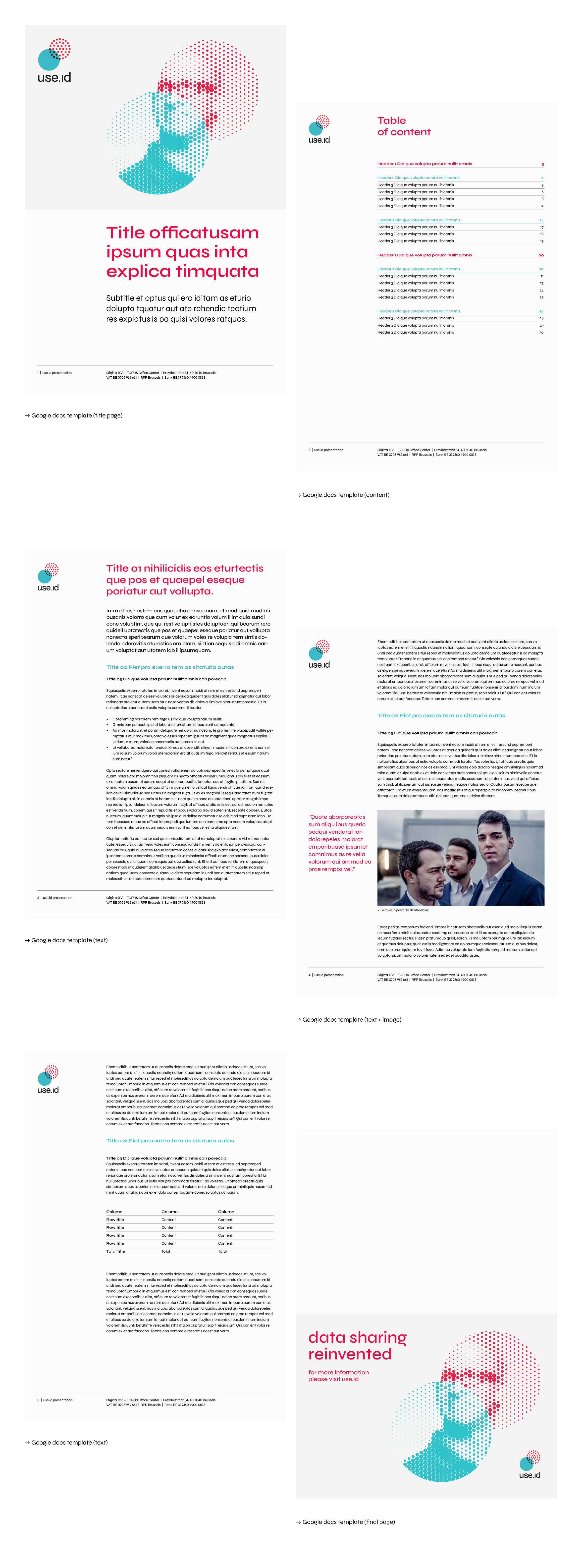
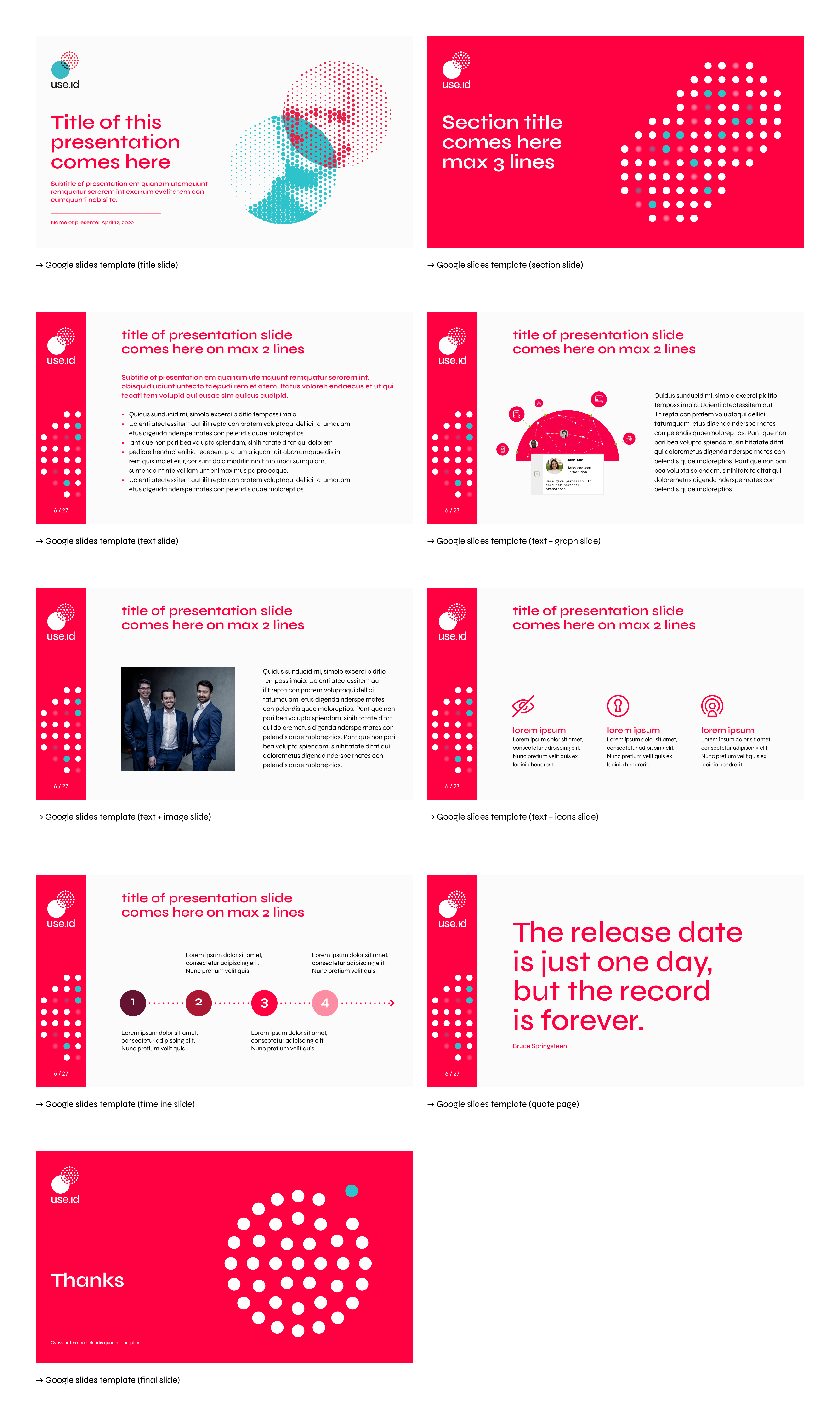
The following examples (Google Docs template & Google Slides template) show how the identity is implemented. More examples will follow soon.
Studio WillemsPeeters © 2022